Wonders 21
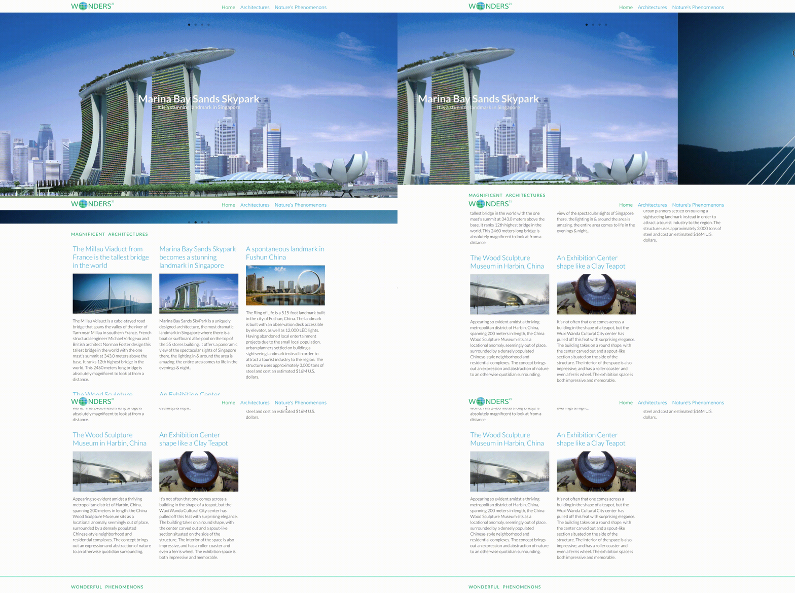
The project was built for a mobile design course. It was the introduction to mobile-first design where present content with great visuals could enhance the viewing experience. The content would focus on delivering amazing imagery about architecture and natural phenomena of the 21st-century.

Designing the Logo
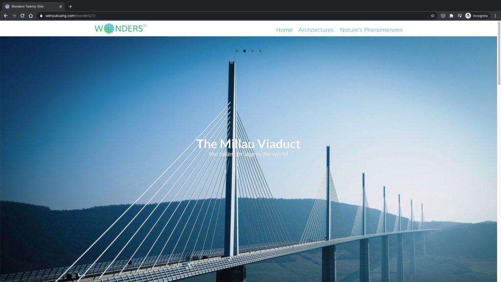
The logo was all uppercase Helvetica. The “O” was being graphically designed into a globe. Half of the pixels were colored green to represent the land, and the other half were colored blue to represent the sea.
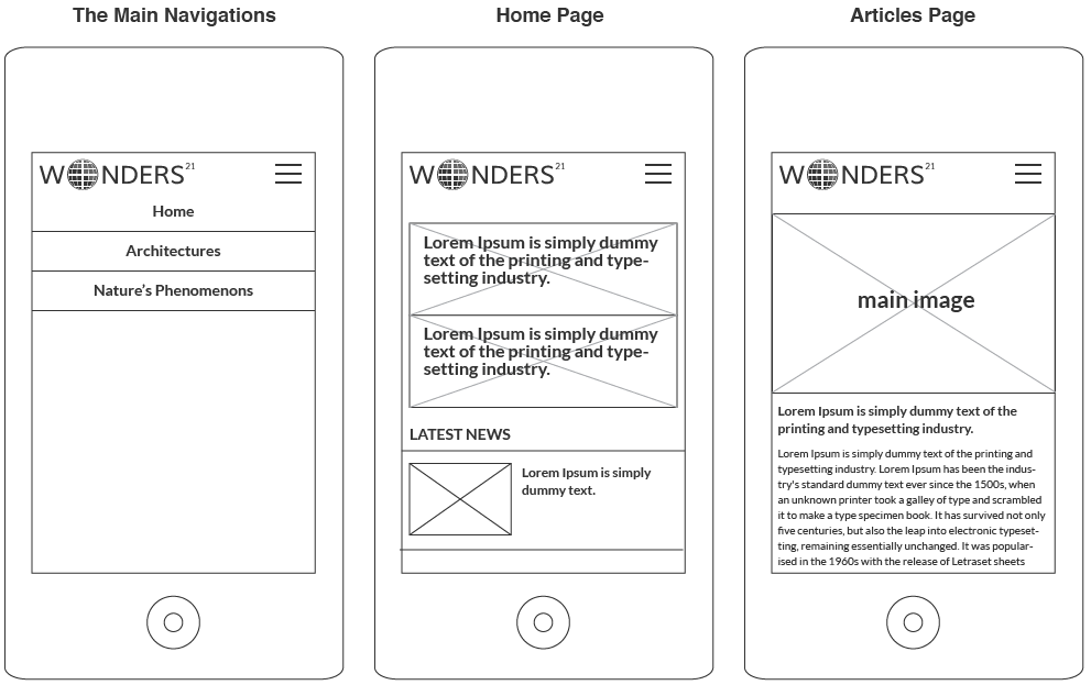
Wireframing the Design of the Website
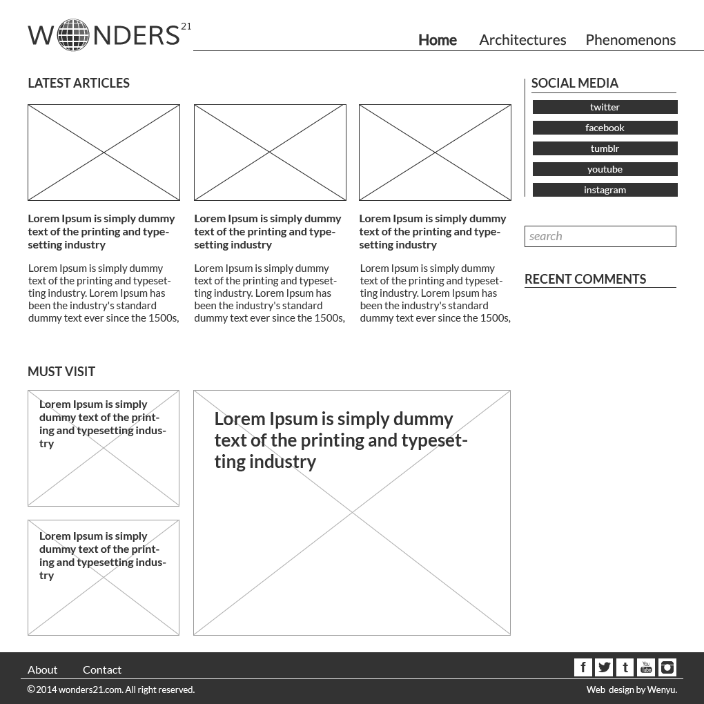
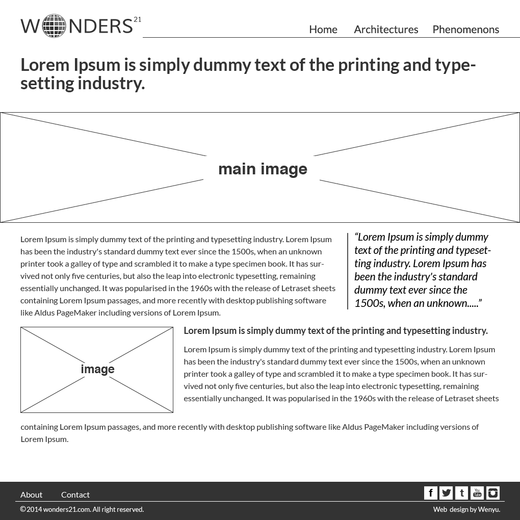
The website was designed and built with three pages include Home, Architecture, and Phenomena. On the Home page, the viewer could see a combination of content include a featured slide show and two section of articles. The other pages would list headlines about the great buildings featured and natural phenomena, respectively.
Experimenting with Parallax and Curtain Effect
To give visual interest, parallax and curtain effect were implemented for the project. Both techniques allow for a different rate of movement between the background and foreground on a webpage.
