Volunteer Opportunity
This project was created for UX & UI Design course. It was one of the capstone courses where students dove into the step-by-step process to produce a user-centric design. The topic assigned to our group was community service/internship, which we renamed the project to Volunteer Opportunity. The project progress divides into two parts that span across the entire semester. We began brainstorming and planning as a group. Then I finished the branding, style guide, and prototype as an individual.
The Group Stage
The team was made up of four people. In the beginning, we were excited. But the excitement and enthusiasm quickly fell off as some members were missing works and being absent in meetings. Determined to see the project through, I became the accidental team leader. As a team leader, I have to coordinate communication, take extra responsibility to work on each task, update the team on the progress, and encourage members’ participation.
Research Interviews and Personas
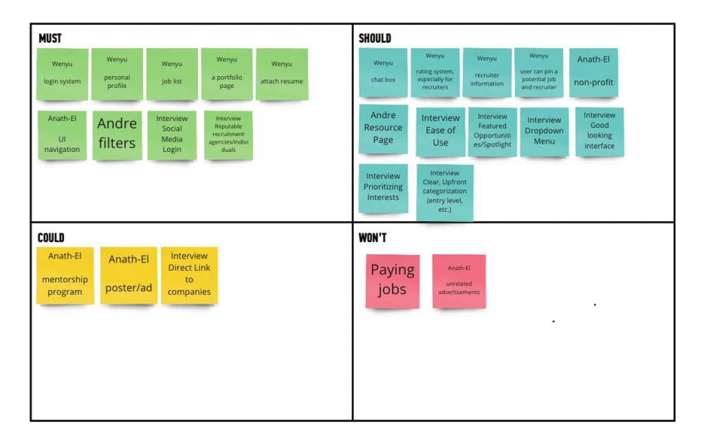
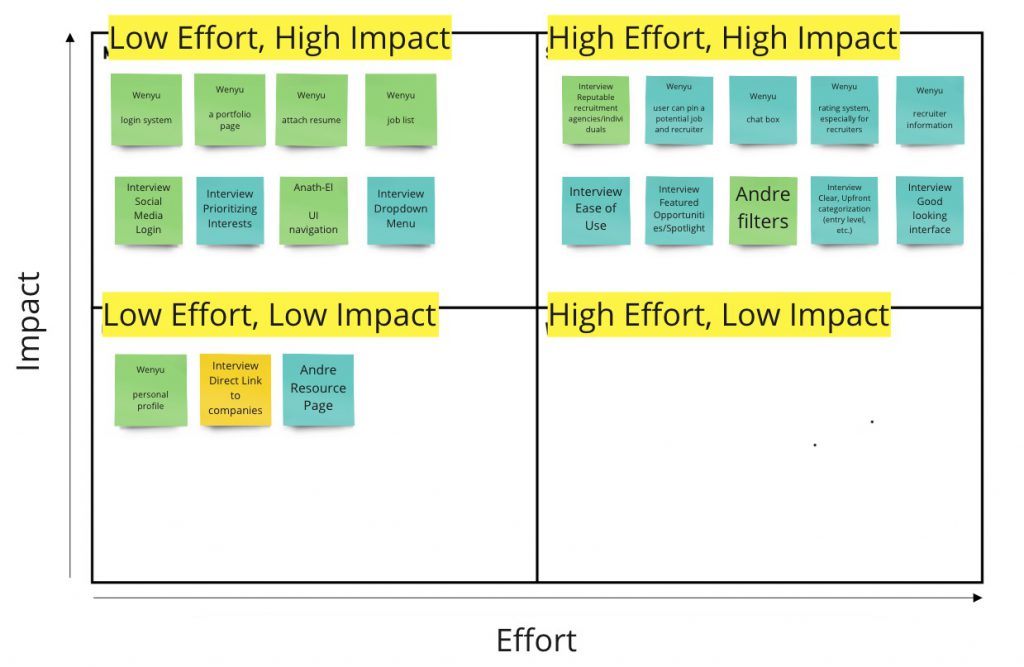
At this phase of the project, I had set up a time for the team to come together at a virtue meeting where we worked on the MoSCow Map and Feature Prioritization Chart. We wrote down all the features and ideas that the app will do or not do across the four quadrants of Must, Should, Could, and Won’t. This exercise enabled us to observe what everyone’s thinking for the app. Using the same features and ideas we wrote down in the MoSCow Map, we transferred them in the Feature Prioritization Chart. The chart allowed us to see what features can produce high impact for our app. At the same time, we got a sense of what we would able to prototype within the 2nd half of the semester.
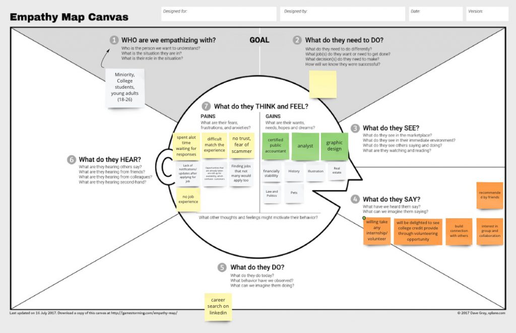
Next up, each of us was to conduct two interviews of college students. I conducted three interviews while another team member conducted two. We ended up with only five interviews in total due to a lack of participation from the rest of the members. We then archived those similar themes that appeared in our interviews. From the Empathy Map, the participants’ feelings of pain with existing platforms included fear of scammer, lack of responses, difficulty to match experiences, and many legacy job posts. At the same time, participants were exhibiting wellness to try different jobs, group collaboration, and build connections with others.
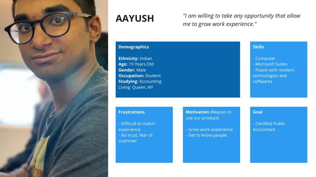
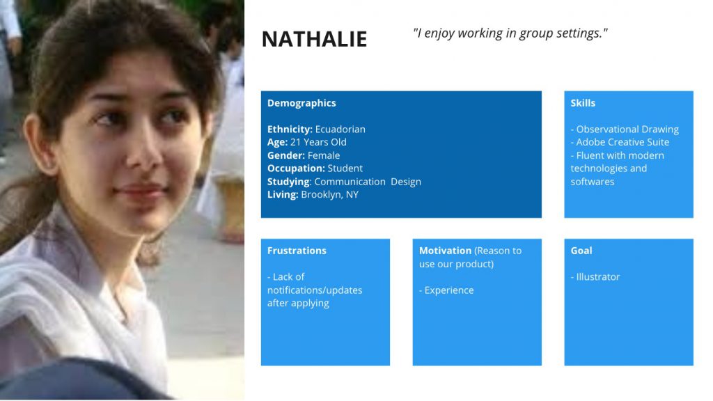
After the Empathy Map exercise, we took all of the information and compiled them into two personas. They serve as the basic model of how our potential customers would look in the real world.
Brainstorming Ideas and User and Journey
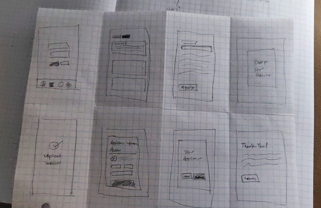
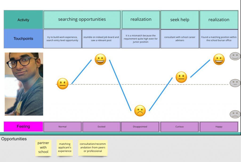
We did a few Crazy Eight sketching sessions – drawing eight frames in eight minutes. This exercise set the foundation for us to visualize the user journey. We continue our works in the next step creating a Customer Journey Map. It helped us anticipate how a user will find out and use our app.
Planning the Information Architecture
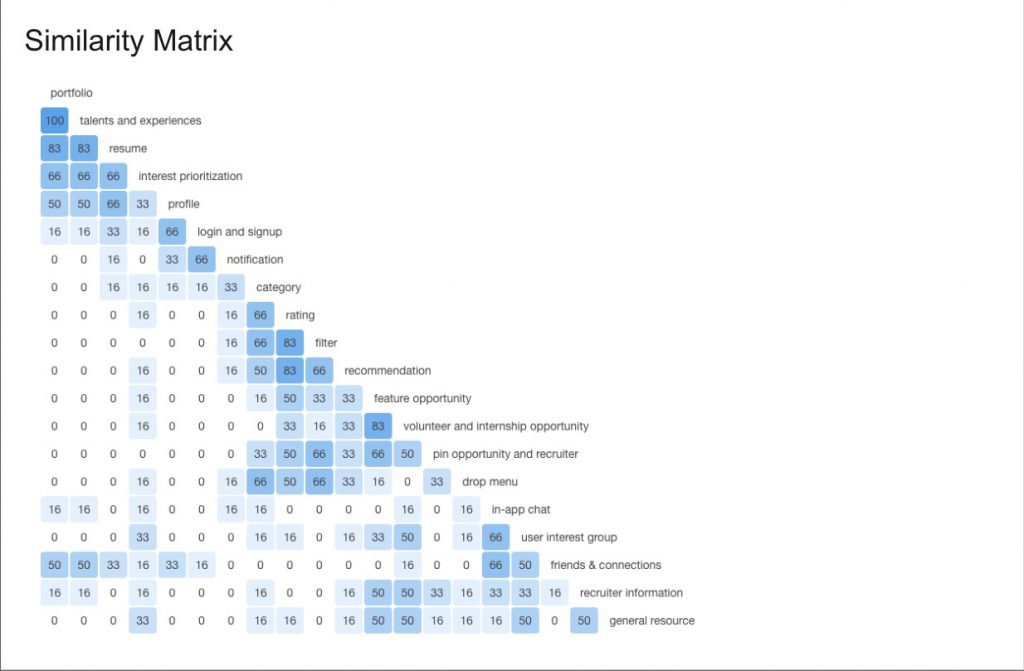
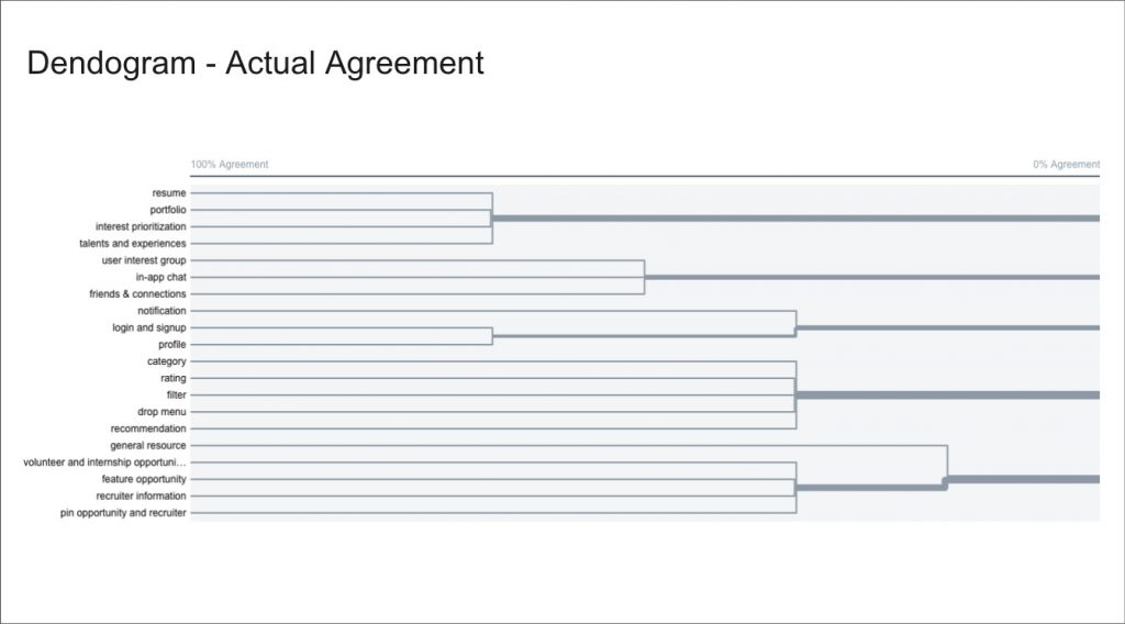
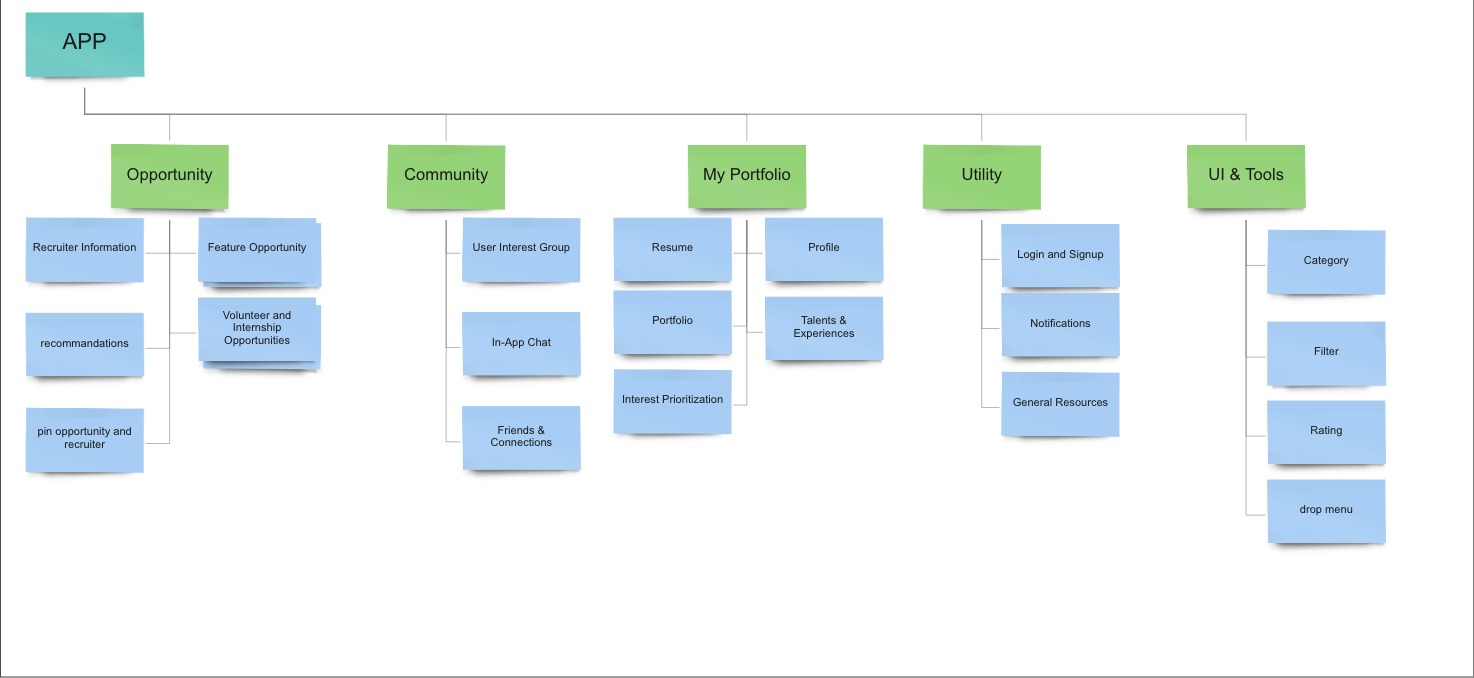
As we worked to plan out the app’s information architecture part, we leveraged Optimal Lab to conduct an open card sort research of twenty different phrases. In this research, participants are free to arrange these phrases in groups as they like. We recorded about ten participants, which is the maximum limit for free research under Optimal Lab’s term. However, these workflows provided valuable insights. We used the findings to draft the app’s site map.
The Individual Stage
The second half of the project was an effort achieved by myself. At this moment, the project moved into developing the app’s visual aesthetic and brand identity. The comprehensive project included deliverables such as logo, messaging, style guides, task flow, user flow, wireframes, prototypes, and usability testing. Due to the circumstances of remote learning and lack of reach to people physically, there was not much usability testing done except for one. In the end, my goal is to create a working frame-by-frame demonstration of a single task flow that the user can perform in the prototype.
Plot a Task That User Can Perform
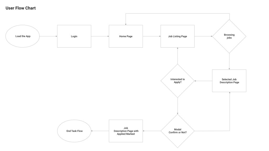
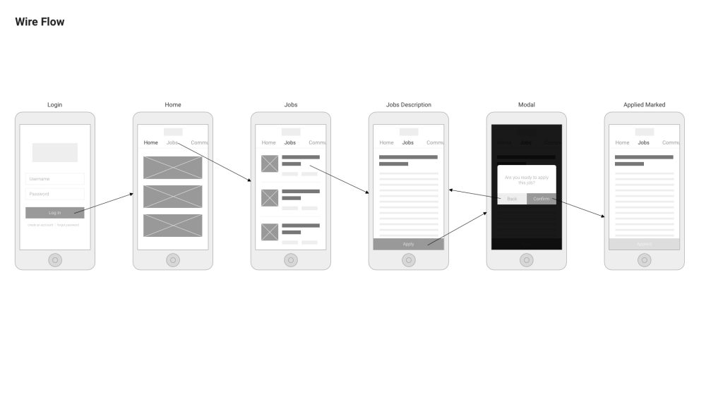
In this step, I listed all the actions users would take to complete the task in a task flow. It helped me keep track of the frames that were needed to create later. Afterward, I expanded those listed actions in a flow chart which reflected how users navigate to complete the task. Finally, I constructed the wire flow, a set of low fidelity wireframes, that served as the visual guideline for each application screen. These frames gave general documentation to the element on each screen that the users would interact in order to move on. While these elements were represented in simple geometric shapes, they served as the foundation for the actual design of interfaces in the app.
Develop the Banding and Style Guide
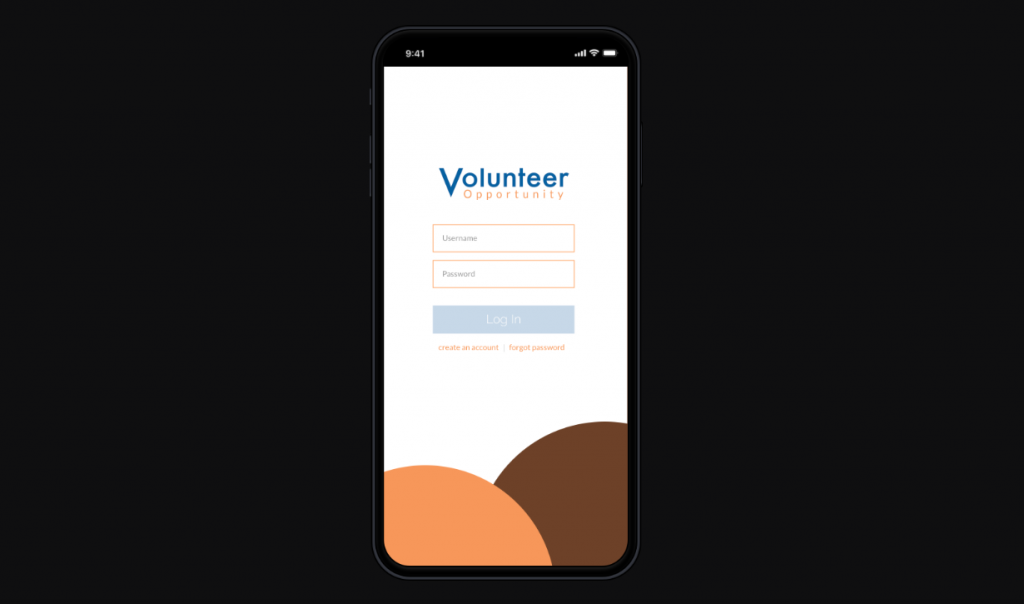
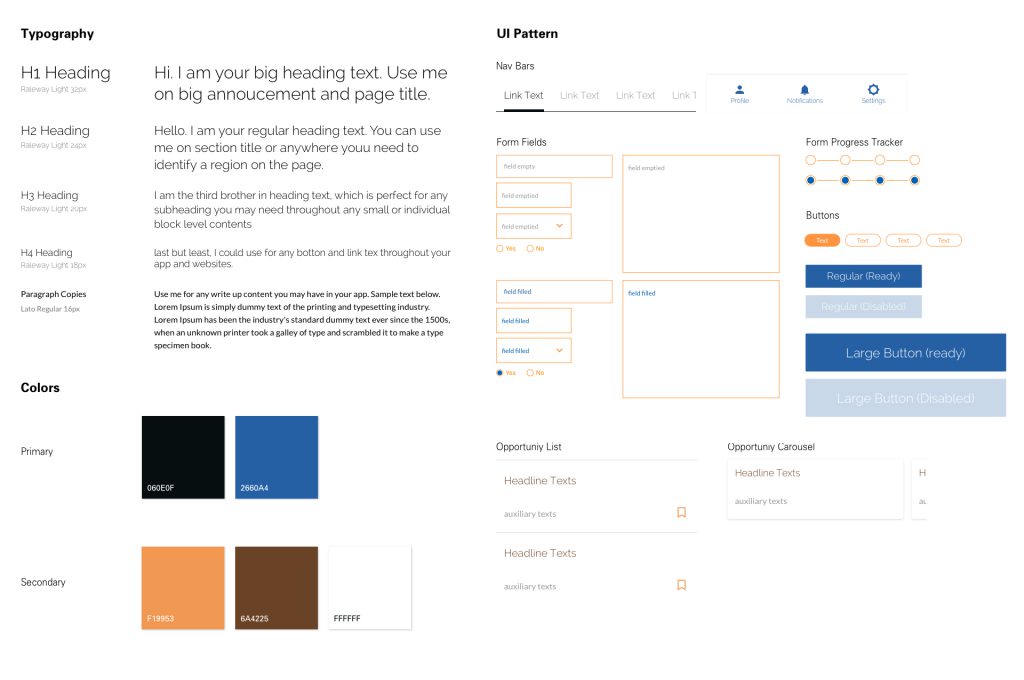
In the branding phase, the focus was to create a logo, brand message, and style guide. The logo was essentially a wordmark. The name was written out in full because the Volunteer Opportunity was not an establish organization, and it needed exposure to its name. In the brand message, the organization see itself as a counsel to student start or building their career path. As such, the app would reflect a sense of the smart, dependable, and keen aesthetic.
The Prototype
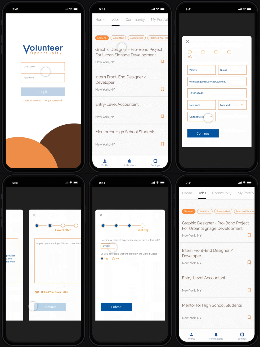
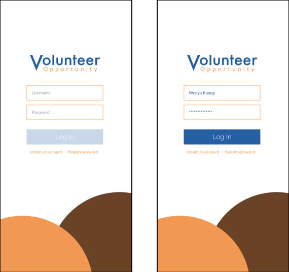
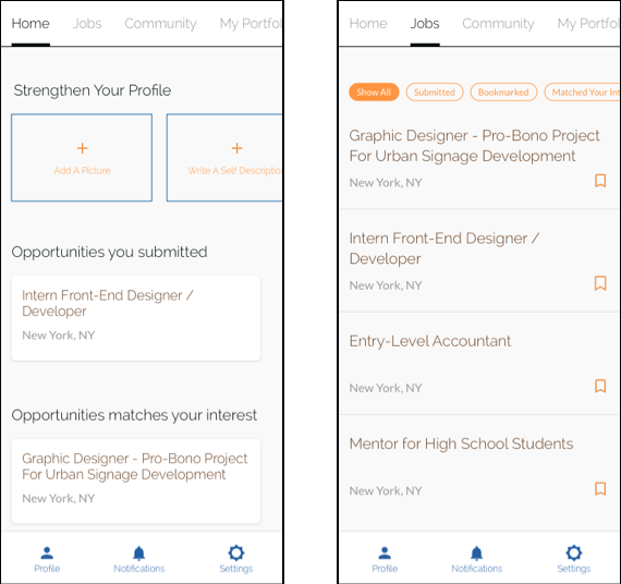
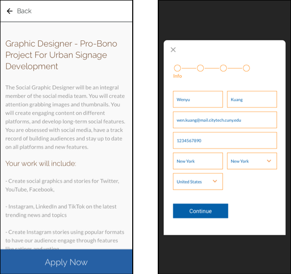
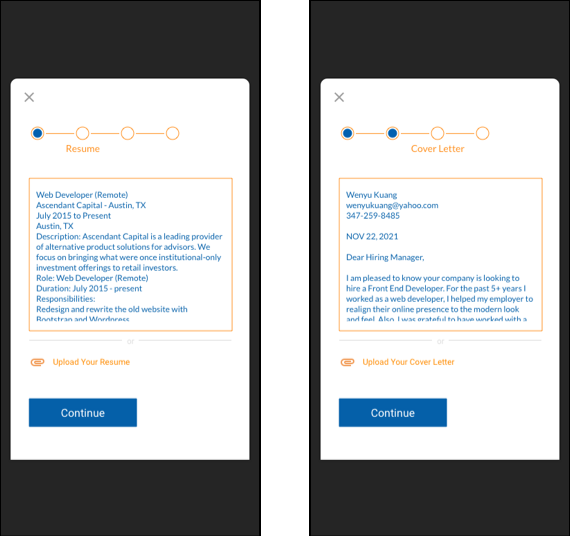
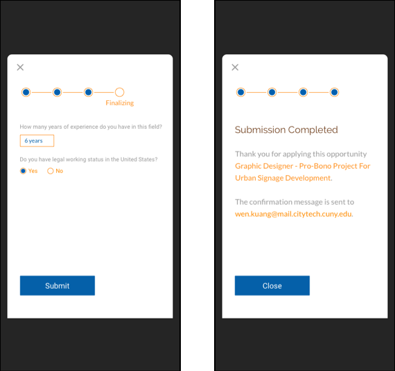
Creating the prototype was the last step in this project. At this point, I produced the high-fidelity mockup. Using the skeleton of the wireframe created earlier, I transformed and gave details to all the branding elements, contents, interfaces, and aesthetics to reflect the actual product the users would interact with and see. Finally, I marked the area of interaction and generated a live demo of the prototype through software such as Sketchapp and InVisionApp.
