Wenyu, Your explanation seems clear to me. Once I try it. I'll know if I need to call you! Thank you so much for taking the time to answer in detail.
– Melody Lawrence
During his career as a well-traveled photographer, Putnam has created many visual essays that he wanted to share online. The challenge was to present this extensive portfolio of photos seamlessly and effectively on his new website.
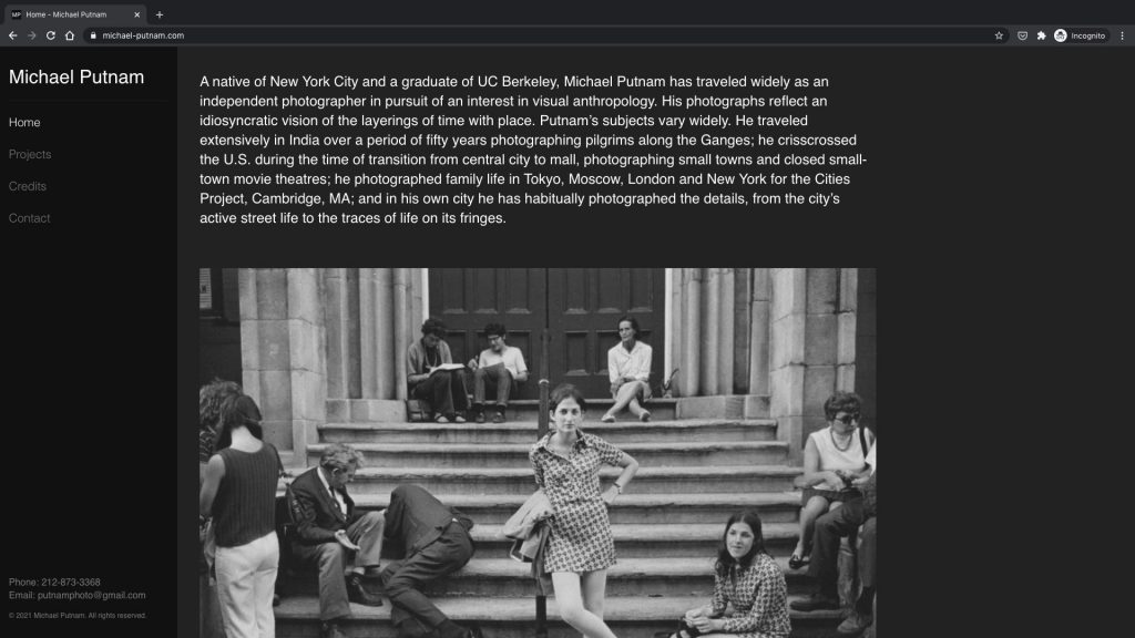
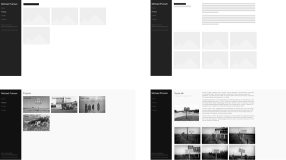
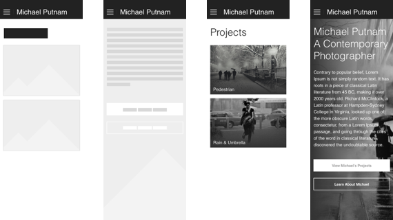
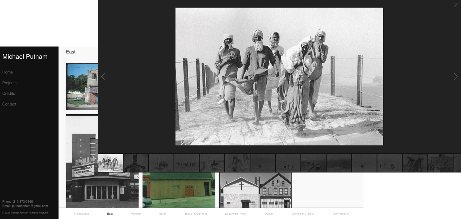
The website was designed and built with responsiveness in mind to accommodate the three standard screen sizes: mobile, tablet, and desktop. Because the client had shot mostly with film and the photos are primarily black and white, the use of matte dark gray and white as background colors worked really well for the design.
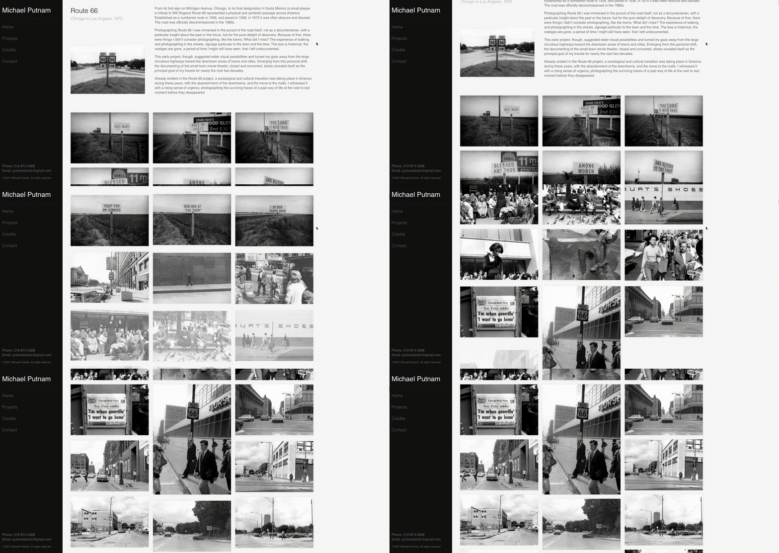
Putting a large quantity of photos on a webpage could take a long time to load. To present the client’s photos fluidly, a programming technique called a lazy load was introduced. It’s an on-demand system that loads photos as the viewer scrolls the page so the images flow gracefully into view.
To enhance the presentation of each photo, a custom lightbox system was built in which the image on the grid will be shown in a large format over a dark gray background. The lightbox also has a carousel feature that allows viewers to navigate through images on the page. Also, an in-page menu was added to help view each section.
Wenyu, Your explanation seems clear to me. Once I try it. I'll know if I need to call you! Thank you so much for taking the time to answer in detail.
– Melody Lawrence
Thanks for the advice given Melody. All very helpful in finishing the current website. I've looked at it closely and think it looks great!
– Michael Putnam